Best settings for Circular Text on Wix
Featured Apps
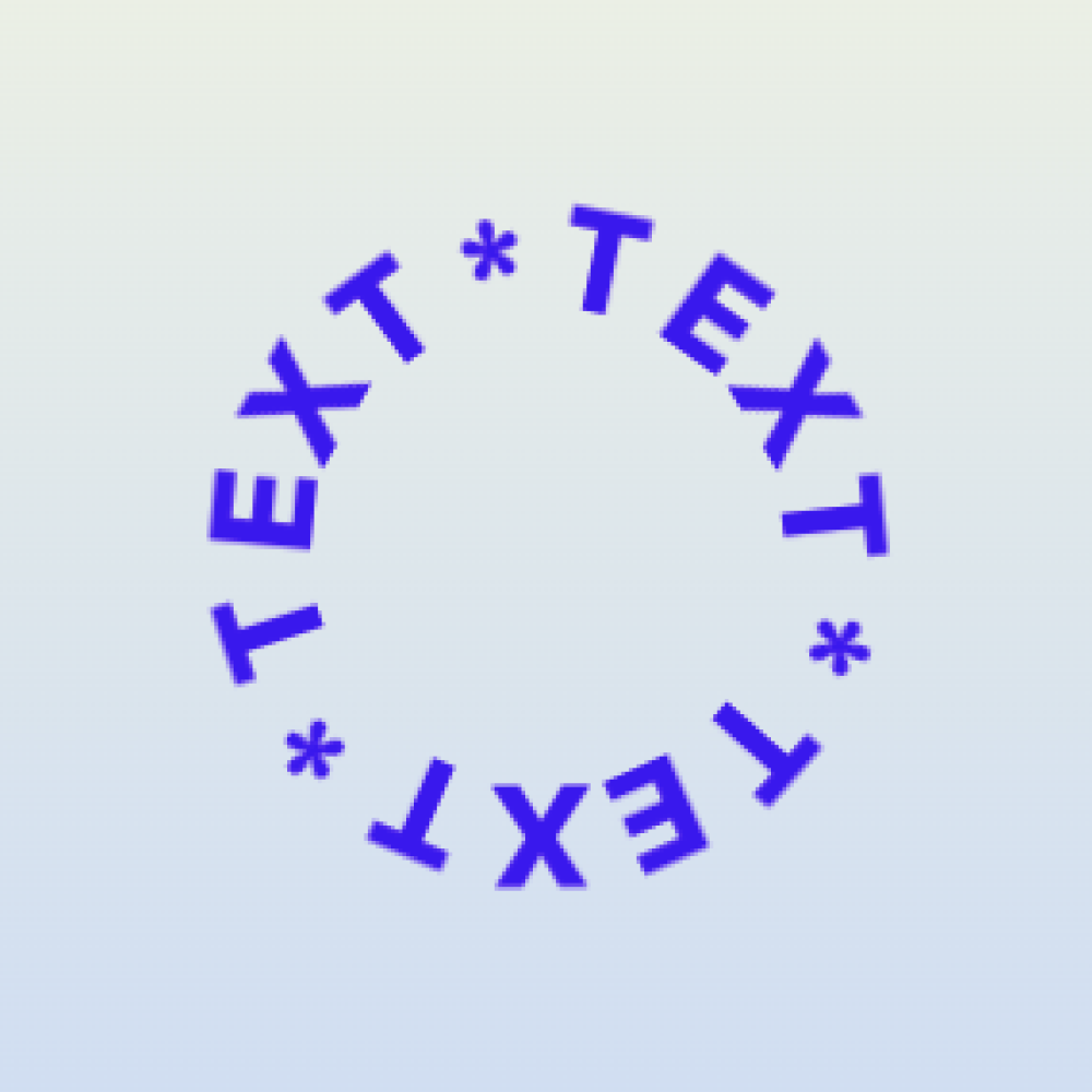
The best Circular Text settings depend on legibility. A curved text effect should add character while remaining easy to read, especially on mobile screens.
Start with size
Make the circular element large enough that each letter can breathe. Very small circular text often looks interesting in the editor but becomes hard to read on mobile.
Adjust spacing
- Increase letter spacing when words feel cramped.
- Reduce spacing when the circle looks broken apart.
- Use shorter phrases for tighter circles.
- Avoid long sentences.
Choose the right font
Simple fonts usually work better than very decorative fonts. If the letters are already ornate, curving them can reduce readability. Test the design at the smallest expected screen size.
Placement checklist
- Does it support the nearby content?
- Is it readable on mobile?
- Does it overlap important buttons or images?
- Does it match the brand style?
- Is the effect used sparingly?